Table of Contents
When creating great websites, it is critical to apply design principles in various ways to create visually appealing and practical designs.
Your website's design is essential to your customers! You can implement every strategy to increase conversion rates or make Google happy (increase your SEO ranking), but if your website is unpleasant, so will your results for your business objectives.
People and businesses have realized that having a strong online presence can bring them more customers and raise brand awareness. However, the internet is teeming with websites. Anything you search for on Google or Ecosia will return thousands of websites. As a result, you must devise strategies for capturing the visitors' attention.
This article will cover these principles, why they're essential, and how they apply to Chicago web design Company. You'll already be ahead if you have rules to follow and goals in mind.
Here are the following 7 Key Principles of Designing Visually Appealing sites:
- The Purpose of Your Website:
The first basic principle concerns the purpose of your website. That is inextricably linked to the design of your website. Your website can have a variety of meanings. You could try to sell goods or services. You can use it to improve your reputation and raise brand awareness.
A website can generate leads, share tips and tricks, and educate visitors. You can select design elements based on the goals you want to achieve with your website. The website's design purpose will help you create a visually appealing website and choose a style.
- Maintain the balance of your design:
The main objective of balance is to avoid having your website design lean to one bottom or the other. It is similar to the weight balance in achieving symmetry or asymmetry.
That is asymmetrical balance, and it is what balance is all about. Size, color and the addition or removal of elements are all ways to change the visual weight of a design. For example, if you made the cross a bright orange, it would become heavier and throw the layout off again. Achieving asymmetrical balance is particularly delicate and requires practice and a trained eye to master.
- High-Quality Visuals:
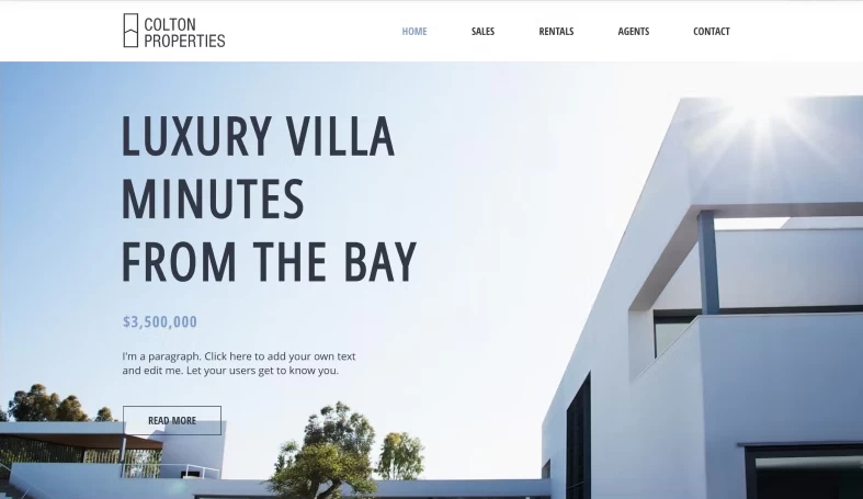
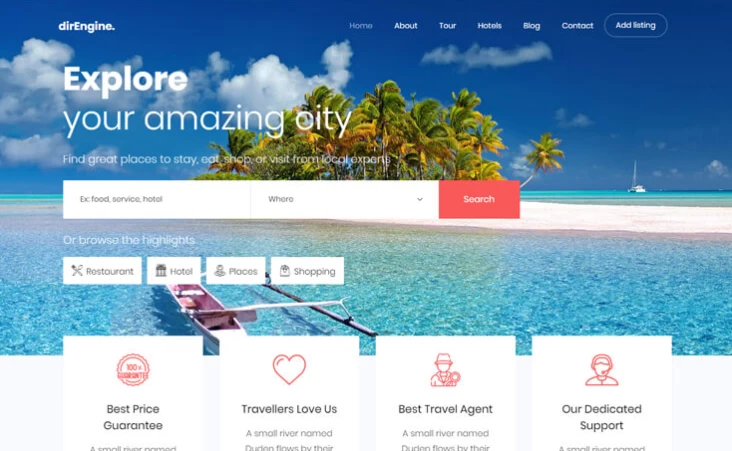
You must use high-quality visuals to attract visitors' attention and persuade them to spend more time navigating your website design. Therefore, photos, videos, infographics, and other visual elements should be of high quality.
Nobody wants to see pixelated images on a website that sells products or ideas. However, you want to persuade your visitors of something and use the best visuals available. That will make your website more visually appealing and convey that you are trustworthy and professional.
- Don't Be Afraid of White Space:
It's difficult to overestimate the value of white space. It not only helps to reduce cognitive load for visitors, but it also allows them to perceive the information presented on the screen. For example, when a new visitor approaches a website design layout, the first thing they do is scan the page and divide the content area into digestible chunks of information.
Complex structures are more challenging to read, scan, analyze, and work with. Therefore, the whitespace solution is usually preferable if you separate two design segments with a visible line or some whitespace.
- Improve the typography on your website:
Because it encompasses so many elements, the art of type is challenging to discuss. While it can be considered a branch of website design, mastering all of its aspects can take a lifetime. We will restrict our discussion to what will be of immediate benefit to you because this is not the place to provide a comprehensive typographic reference.
When compared to print typography, web typography suffers. The most crucial distinction is that, due to the dynamic nature of the Web, we do not have complete control over the appearance of type. Dynamic rendering has advantages, but for the time being, Web designers have little control over the results.
Dynamic rendering has advantages, but for the time being, Web designers have little control over the results. In addition, web typography is a difficult, if not frustrating, task due to missing fonts on the user's computer, browser and platform rendering differences, and generally poor CSS support. While we may have to wait until CSS 3 to fully realize Web typography's potential, we now have the tools to make it look exciting and, more importantly, pretty.
- Use Effective Writing:
Because the Web differs from print, it must tailor the writing style to the preferences and browsing habits of the users.
Avoid cute or clever, marketing-induced, company-specific, and unfamiliar technical names. For example, if you're describing a service and desire users to create an account, "sign up" is preferable to "start now!" which is beneficial to "examine our services.."
An ideal solution for effective writing is to
- Use short phrases (get to the point quickly) and a legible layout (categorize the content, use visual elements, bulleted checklists which split the flow of uniform text blocks and use multiple heading levels).
- Use simple and objective language (a promotion does not have to sound like an advertisement; give your users a reasonable and objective reason to utilize your service or visit your website design).
- Leading and Measuring:
The length of lines is measured, and the lines' height (or vertical spacing) is led. You can control Measurement in CSS by specifying a width for the containing container (e.g., the section element). Both influence readability. Users will be uncomfortable reading the content if the lines are too quick or too lengthy; this is a common issue with fluid layouts. A character count of 40 to 80 per line is ideal.
The line-height CSS property can increase (or decrease) the leading (if desired). For example, a line height of 1.5 works well for paragraphs. That means that when the text size is 12 points, the line height becomes 18 points (12 1.5), giving the text some breathing room.
Conclusion:
The seven critical principles discussed here are not the only ones that apply to good website design. Usability, readability, and accessibility are also important considerations.
That is why the web design company Chicago is so challenging. Getting your feet wet in design is simple, especially now that there are many content management systems, blogging tools, and themes to choose from. However, genuinely mastering all aspects of Website design takes time and, let's face it, talent. The ability to create beautiful designs is just one aspect, but it is an important one.


